Tuesday, December 3, 2013

Website Brainstorming

So I have to make a website. Something I've never done before. Am I nervous? Of course! But here are some ideas that I'm thinking about for the site:

Strategy: 
What are your site objectives?

I hope to complete a site that is easy to navigate and is aesthetically pleasing. In terms of content, I hope to make the information that I present easy to understand and easy to relate to. I would like users to be able to see what I can do as well as my potential for other things.
What are your objectives as a producer?

As a producer, I hope to make the site's navigation easy and to effectively deal with obstacles that come my way.
Do you want an internship? Grad school acceptance? A job? What field specifically?

As of right now, I'm not looking for a job through this website. If someone would offer me a job, I would definitely take a look at it to see if I was interested. Although it is not my primary goal, I would still like to have the site to show potential employers what I am capable of.
Who is your audience? 

My audience is whoever comes across my site. I hope that my audience finds the answers they are looking for within my site. I hope to be able to show possible employers my skill set. 
What are their user needs? 

The user would need to have easy access to the information that they want, perhaps a search bar is in order? The audience would also need to be able to see information about me and be able to contact me either in the form of comments or email. They would also 
What all might they need to find out about you on your site? 
My users would need to know that I am a junior at Furman University, plus my experience. This could be included in a short biography or contact info section. Other information would be included in a resume.
Scope:
In my site, I would like to include content on my experiences, my other social media accounts (twitter, tumblr, pinterest), a contact form, materials that I have created from my digital communications course, writing samples, my resume, and photos or experience blurbs about what I have done in the past, professional or not.
Website design inspirations:
1) Plentific: I really like their intro page. The search bar is very obvious and the background is large and a photo. They also have a very simple navigation down at the bottom of the page. Since I am a photographer, I might incorporate this aspect into the site.

2) Amp Music: Like the first site, the site title is backed by a photo (it is actually a gif of people at a concert). Also, I really liked the links to Twitter and Facebook at the top right hand corner. I definitely want to include my other sites on my personal website.

3) Names for Change: This website is very interactive and simple. I would recommend actually checking this one out because a screenshot would not do it justice (plus the screen changes as you scroll down)

4) The Stapleton: This site is also simplistic, while being aesthetically pleasing. It offers an insight into the site creator as well as grabs its readers as soon as they read the words.

5) Tillamook: This site is also a scroll down site, but I did particularly like their intro. They proposed a story and literally invite the reader to see what their path was. It is simple and inviting, but not intimidating.

Wednesday, November 20, 2013

People! People! People!

          In Redish's Letting Go of the Words, Chapter 2 discusses how to create a web site with good communication. The steps that she tells the reader to include on how to get a better sense of her readers are as follows:

  1. List your major audiences
  2. Gather information about your audiences
  3. List major characteristics for each audience
  4. Gather your audiences' questions, tasks, and stories
  5. Use your information to create personas
  6. Include the persona's goals and tasks
  7. Use your information to write scenarios for your site
One of the most communication heavy sites that I can think of is Facebook. It literally was created in order for people to communicate. It was initially only open to Harvard students and from there expanded to other colleges, to all students, and finally, to the rest of the world. The developers for Facebook had to have gone through all these steps whether they knew it or not. Do you agree? Do you think Facebook was one of the pioneers of communication online? What about Myspace or Friendster? Why did they fail?
  1. Major audiences: College students
  2. Info: they want to communicate with each other
  3. Characteristics: Lazy, want to know what's going on without much effort
  4. Questions, tasks, stories: want to connect to people, tell their own stories
  5. Personas: each individual created their own profile, thereby allowing the developers to know about them
  6. Goals and Tasks: to let students see information about their fellow students and be able to share information about themselves
  7. Scenarios: the navigation used by the audience, they want to change a certain setting, add a new picture, etc.
          In chapter 3, "Starting Well: Home Pages", Redish discusses what to put and not put on a home page. She also tells the reader what the audience will expect from a home page and what they will not pay much attention to. She explains that the user experience is a key aspect of the site, making sure the audience can get to where they want to go without much trouble. Using Facebook again, it is relatively easy to add a new picture or change your status, but when it comes to deactivating an account, the pathways to get there are much trickier. This is because Facebook does not want its users to deactivate their accounts. This is their way of controlling their users. Do you agree? Does it just so happen that this portion of their site is more difficult than the rest? Or is their a hidden motive for it?

Monday, November 18, 2013

User Experience

          In Jesse James Garrett's The Elements of User Experience, Chapter 1 "User Experience and Why It Matters" discusses what user experience is and what role it plays in a customer or client's choices. The most obvious example of a service that is used by a wide volume of individuals that came to my mind is Google. Google has a large diversity of people that they help each and every day. When Bing came along, it faced the large Google audience to persuade. The only problem was that Google had build up a loyalty with its users, and those users also saw no reason to switch to Bing. There is nothing wrong with Google, and since it is now linked to many other parts of their users' lives, it makes finding what the user wants easier than ever. Bing promoted a "Bing It On" campaign in which users could do a search and choose which engine they liked the most. It was anonymous as to which search engine was on which side of the page, which gave the site credibility. This was because they were letting the user choose what they liked instead of putting forth their own page and the results and claiming that their page was superior. What do you think? Do you like Google or Bing better? Why? Why do you think people choose Google over Bing?
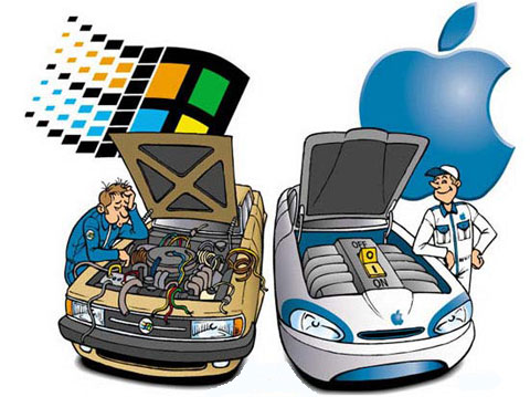
          Another common comparison of user experience is the Mac vs. PC debate. Mac came in with their computers, boasting an extremely friendly user base in which people who were not as tech savy could now navigate a computer, specifically a Mac. This converted a large amount of people from the harder to understand PC to the user friendly Mac. Are you a Mac person? Why or why not? Does it have to do with the user experience of that particular product?
          In Chapter 2, "Meet the Elements" Garrett puts forth five planes, or layers, of a website. This includes the surface plane, the skeleton plane, the structure plane, the scope plane, and the strategy plane. These planes are claimed to be the layers of a website interface that a user has to face. The surface plane would be the images of a product that a user could purchase, the skeleton plane would be the button placement and controls of the site, the structure plane would be the navigational aspect of the site, the scope of the site is what is appropriate for that particular site, and the strategy plane is determined by what the users want as well as what the people running the site want.

Thursday, November 14, 2013

Monday, November 11, 2013

Getting It Right?

          In Brian Carroll's Writing for Digital Media, Chapter 6, titled "Getting it Right", discussed the processes that an online page has to or should go through before becoming published.
          In particular, Carroll talks about some differences between online editors and print editors. The main difference that he pointed out that caught my eye, was that online editors need to possess different skill sets than print editors. Online editors need to be able to "create a simple web page and have a basic understanding of XHTML and CSS" (128). I have been surrounded by people that all tell me that knowing how to code and use interface is a very valued skill set. Not many people are incredibly good at it, and a lot of people have never coded anything. I fit very nicely into this category. One website that I have been told of is Code Academy. It walks you through very basic things and has tutorials to help. It is a good way to learn how to use computer coding without a time pressure or grades hanging over your shoulder. You can learn to code at your own rate. Do you think coding is as important as everyone thinks? Should it be a mandatory thing taught in schools? Why or why not?
An example of a Code Academy tutorial
          I also thought it was very interesting that Carroll pointed out that online editors should print out the webpage that they are editing and read it aloud. If they printed out the page, couldn't it technically be called print editing? This was something that confused me. Should editors have a chance to work at both mediums? Should their be different training for each since they are apparently so different? Why or why not?

Thursday, November 7, 2013

Point of View

          In chapter 3, "Point of View", of John Douglass and Glenn Harnden's The Art of Technique, the different points of view in literary form as well as film are discussed. One of the first things that are pointed out, is that "POV refers to a camera shot taken as if seen through the eyes of a character" (31). This made me think of a movie that I had recently watched, Psycho. In
it, there are several scenes which take on the point of view from the main character, Marion, as well as different opposing viewpoints. The money that she has stolen, for example, takes on a point of view role as well as Norman Bates, the owner of the motel that she stays at later in the film. The first example of this that I notices, was in the scene where Marion is packing. The audience takes on her point of view, but as the camera shows the money, it then portrays the money's point of view. It looks from the bags that Marion is packing to her. The audience sees what is happening from that point of view instead of Marion's. Another example would be when Marion first stays at the motel. After she gets settled in, the audience takes on the point of view of Norman as he peeps through a hole in the wall to look at Marion. The audience thereby takes on his point of view.
All the Houses in Game of Thrones
          In literary texts as well as films, there are three different types of point of view. The first is first person, in which the point of view of one person is followed throughout the narrative. Second person is not a very common point of view, but it is when the audience or the reader is the main character. The things in the novel happen to the audience or reader. A good example are the books that are "choose your own". The reader is able to choose what path he or she takes. The final perspective is third person. In this type of narrative, the audience is a viewer to a multitude of things happening that the characters may or may not be aware of. This is the easiest and the most common type of narrative, since the audience can see things that come into play that the main characters might not. A good example of third person is Game of Thrones. If this narrative was told in first person, the reader would only be able to follow one person throughout the whole storyline. George Martin uses third person, which allows the reader to see what is happening in all different parts of the world in Game of Thrones.

Monday, November 4, 2013

The Unrecognized Skills of Editing

          "I keep telling my editors, if you win an award for editing, I won't work with you anymore. Your editing shows". This is a quote from Louis Malle, director. He makes a point of how editing should not be a heavily noticed thing. If it shows, you are not doing a good job. 
          Potential setbacks to an editing session include limited footage, nonexistent natural sound, and a lack of continuity options (Osgood and Hinshaw 227). These are pointed out by Ronald Osgood and M. Joseph Hinshaw from their chapter "The Aesthetics of Editing" from the book Visual Storytelling. This stuck me especially since I just went through filming a couple of interviews for our class. I had to use a microphone so that the background noise would not overpower the interviewee's voice. There was one instance in which a cat came by and rubbed itself on the microphone and I was terrified that it would interrupt the sound quality. Thankfully it did not affect the sound and the voice of my interviewee came out clear. This also makes sense in that sometimes voices are b-rolled over a scene when the actors are too far away to make out their voices clearly. Do you think there should be more innovation where editors and filmmakers are concerned? Are they good where they stand? Why or why not?


Here is a video that shows some popular editing cuts that have mistakes in them:


          Later on, the authors mention the stylistic changes that the editors took into play as the years went on. The specific argument they use is the example of the music video narrative versus the artistic video. In other words, the story versus the dance music video. This as well as television commercials gave editors the chance to break into new territory editorial wise. They were able to play with different set ups and narratives, which set up the media industry as it is today. Do you think the industry should pick one type of narrative over the other? How do you think the changes came about? Was the culture an influence to the narratives or vice versa?


Here are a couple of music videos to compare narrative forms:
The story narrative:
The artistic narrative:

Here are a few advertisements from now and the past:
The past:
Now:

Thursday, October 31, 2013

Screen Asthetics

          In Chapter 7: "The Two-Dimensional Field: Forces Within the Screen" of Herbert Zettl’s Sight, Sound and Motion: Applied Media, he discusses how simple things, like screen tilting, can have huge impacts on the way that people view images. One of the first things that he points out is that "when we see a tilt to the horizontal plane within the screen we become somewhat disturbed, if not disoriented" (103). This quote specifically spoke to me because I have a condition called Neurocardiogenic Syncope, in which my blood does not flow to my brain in the way that it should. It is just slowed and takes longer to happen. If I stand still on my feet for 10 seconds without moving my legs at all (no bending or shifting weight) I faint. Before this, I would get really bad dizzy spells all of the time and I did some research on how that happens. When you get dizzy, it is generally from spinning around too fast or doing cartwheels. This creates an asymmetry in the signals that are sent from your vestibular system. Basically, your ears are responsible for telling you whether or not you are right side up. So it makes sense to me if images and screenshots are tilted causing a different effect. 
          Another point that Zettl makes is that there is a much stronger screen presence on the right hand side of the screen. When looking at a screen, the first instinct is to look to the right of the image. He showed two pictures to illustrate this. They were the same image, except one was flipped. The tendency was to focus on the right side of the screen, no matter if it was a person or an object. He later continues this discussion by using the example of television hosts. Zettl points out that the host is usually seated screen-right, while the guest is screen-left. This demonstrates that the host is more important and prominent than the guest. Even the placement of the pictures on this post. When you first opened the page, did you look at the pictures first or the text? Go back to previous posts with pictures on the left and see the difference. Do you agree with Zettl? Does the screen asymmetry play as big of a role as he thinks? Should it? How do you think that this has occurred? Where do you think people understood this knowledge from?

Saturday, October 12, 2013

Open Sky Pt. III

          Part III of Paul Virilio's Open Sky had three sections: Eye Lust, Sexual Perversion, Sexual Diversion, and Escape Velocity.
          The first concept that caught my eye was Virilio's discussion on dyslexia. My youngest brother has dyslexia so what he talked about really sparked my interest.  He claims that dyslexia is a "kind of visual disorder" (91), which I think makes sense seeing as how you have to see the words in order to read them. He also claims that there is a "clear tendency of dyslexics to see only one image at a time instead of the two the human eye normally perceives when images file past in the same direction or are run past at high speed" (92). My brother could just be a different case, but he claims to just mix up the spelling of the words he sees. He is also lazy and will predict what a word is based on the first few letters. He is a slow reader which could relate to what Virilio is saying, but if he is looking at the words slowly, wouldn't he have an easier time reading since the words are not flying by at a fast speed? Another one of my friends is dyslexic but he reads extremely fast. He claims that when he was younger, he had a large amount of trouble in school, but once he learned to work through his dyslexia, he became an extremely avid reader. Do you think Virilio has a point with his claims on dyslexia? Why or why not?
          Another thing that I found interesting was that Virilio talks about "love experienced at a distance" (107). This reminded me of some products I had seen on the internet or in Brookstone. There are pillows for long distance couples in which you can tell if one or the other is sleeping. There are also devices which allow couples to get intimate over long distances. Right before this he claims that the "test tube baby of in vitro fertilization" (107) is one of the most amazing examples of mix-ups in genetic information. I know several people who are test tube babies and I think it is something that is becoming more and more popular. Do you agree? Is this becoming a more popular method for conception? Should it be? Why or why not?

Thursday, October 10, 2013

Open Sky Pt. II

          Part II of Paul Virilio's Open Sky was not much easier to read than the first part. That is my disclaimer in case anything I say here is completely wrong.
          Virilio starts off mentioning that "the human body will become the training ground for micromachines that will travel through it in all directions" (49). This specifically reminded me of two things: I, Robot, and Robo Bees. I, Robot is a movie about everyone owning and being helped by robots. One man, played by Will Smith, believes that the robots are going to turn agains the humans, but no one else does. So, naturally, they do and Will Smith saves the day. Virilio reminded me of this because the dependance of humans on technology is unbelievable today. For example, I de-activated my Facebook profile over the weekend. As a result of this, I lost many of my contacts on my phone, my Spotify account wouldn't work, my twitter was a mess, and so much more. We are so connected to the internet and mass media, that our generation has been the "training ground" for social media to work with.
          In my sustainability class, we watched a video on robotic bees. These were a result of the actual bee population declining due to a variety of factors. These robo-bees would produce honey like normal bees. This would be an example of how we truly would depend on robots for our products and lives. They would produce something that would no longer be available to us through natural means. These literally are "micromachines". Are there any other things that you know of that would fit this "micromachine" criteria?

          Later on, Virilio claims that "the world has shrunk, shrunk unbelievably; we no longer travel, we get around" (62). This also heavily relates to social media in my opinion as well as Skype, Facetime, and so many other devices and programs. To see a certain place or monument, all we have to do is Google it and BAM, there it is. Why would we spend all that extra money to go somewhere when we can just look at it on the internet?

Monday, October 7, 2013

Open Sky (Pt. I)

          Our class was assigned to read Paul Virilio's Open Sky Part I for this post. While I did not understand for the most part what Virilio was talking about, I did pick up on some things that I could relate to other parts of this class, and even other parts of my life.

          Virilio starts off by taking about speed as a relationship between phenomena. He claims that "the speed of light is so important, not only in physics or astrophysics, but in our daily lives" (12). This part of his chapter reminded me of some other articles we have read that mentioned the "three second rule" for a page loading. No, that does not have anything to do with the speed of light, but the whole section that Virilio has is talking about speed itself. Speed is relative to our daily lives in that one of the past articles that we read stated that we would lose interest in a website if it had not loaded in three seconds or less. Another example that I have relating to speed is a video that I have seen that uses jelly beans. This does relate, I promise! It is a stop motion video in which each shot was taken individually. It took over a year to film this 2 minute and 50 second video. Was is worth it? Should they have just used special effects to make this happen? Is it worth  more because of it? Why or why not?
          At the end of the first section in Part I, Virilio mentions that "cities must adapt to their citizens and not the other way round" (21). This made me think of when cities were first developing. This could be interpreted as when America first was settled or as far back as Ancient Rome. When the US was initially settled, it was done so in a fashion that fit what the settlers wanted. They left Europe to live how they wanted to, and that is just what the did with the new land. They developed it how they wanted and the city adapted to their wants and needs. Ancient Rome became what it was because the people wanted it to be that way and they worked towards getting it so. Yes, cities can adapt to their people, but the people also have to work to get that to happen. Do you agree? Or is this a chicken and the egg situation? Why? Why not?

Sunday, September 29, 2013

Compo..what?

          In chapter 6 of Reading Images by Gunther Kress and Theo van Leeuwen, the meaning of different types of composition is fully discussed. The first major example they use is Sony's website. The authors discuss how Sony uses the composition of its homepage to display what might be versus what is. They claim that "the top part shows the pleasure derived from using the company's products, [...]while the bottom part shows a range of actual products" (183). By stating this, the authors mean that the top of the page shows what could be while the bottom part of the page allows customers to order the actual products and make those products part of their lives.
Did the Green light really mean something?
          In another part of their argument, the authors claimed that magazines, books, etc all have what is given on the left page and what is new on the right page. Given means that the reader should already know what is happening on that page, or it is information they have been confronted with before. New means that the information is new to the reader and they should interpret it as such. I think that this might not always be true, but the authors have constructed their argument in such a way that they can argue their claim to always be true. I relate this to certain books and short stories as well as works of art in which the creator did not necessarily put a certain symbol into their work or that they did not give it as much meaning as an analyst perceives. In other words, they can always argue that this claim is true when it might not always be.
          The last point that I would like to touch upon is the authors discussion of visual composition. I thought it was incredibly interesting that other cultures focus on a central composition, while photography students in the US are taught that this is very bad composition. In previous religion classes, I have been presented with Mandalas and have not thought to compare it to the US' form of art. Centralized composition was always avoided in my photography instruction as well as my general art instruction. My teacher claimed that it was bad composition and that there needed to be more happening in the picture. Even when I read comics, the characters would not be in the center of the frame, rather they would be off to one side or the other.
Neither character is in the middle of the frame. They are placed in the bottom left and right.

Wednesday, September 25, 2013

ITSCRAP

          In "Viewers Make Meaning", by Sturken and Cartwright, a large variety of topics are covered. The first topic that caught my eye was the discussion of how ad's target certain audiences. It would make more sense to aim towards the largest audience possible right? This made me think of some ads that I have seen that feature an ambiguous model in that it is not fully possible to determine one particular race that she appeals to. Ad companies do this to appeal to a multitude of audiences. Although this may be the case, one example that comes to my mind is the Furman brochure. We feature a catalogue of many different races shown doing various activities, while in reality, Furman is a campus that has a majority of caucasian students. While the school is trying to bring in more diversity, I think that this is also a form of false advertising. Yes, it appeals to a larger community of possible students, but it is also not a completely true ad. Should Furman change this? Why or why not? How would this affect future students looking at the school?
         Another topic that caught my eye was when Sturken and Cartwright said that "to feel touched by a mass image is to harbor a mistaken understanding of oneself as the individual for whom the image's meaning is personally intended" (51). I feel as though many people can relate to this statement when music is considered. Personally, whenever I listen to a song that I like, the words speak to me and make me think that the song was made especially for my situation. A great example would be Taylor Swift and her songs. Many young girls relate their lives to her songs and believe that their situation fits her songs perfectly. When I hear songs that I personally relate to in an elevator or a store, it opens my eyes to how public music truly is. The same goes for art. Everyone takes a different meaning from each piece.

          One last topic that I would like to mention is that meanings that are supposed to be presented are not always the ones taken. According to Sturken and Cartwright "viewers may make meanings that are not intended or anticipated by its producers, and that viewers are active agents in the production of meaning" (55). I related this immediately to an article that I was referred to by Facebook. It talks about how there are some websites that have unintentionally humiliated themselves by their website's name. One particular example is speedofart.com which is for the website called Speed Of Art, but people can interpret Speed O Fart from it. Should certain advertisers include their specific meaning in their ads to avoid things like this? Should they leave it up to interpretation? Why or why not?

Sunday, September 22, 2013

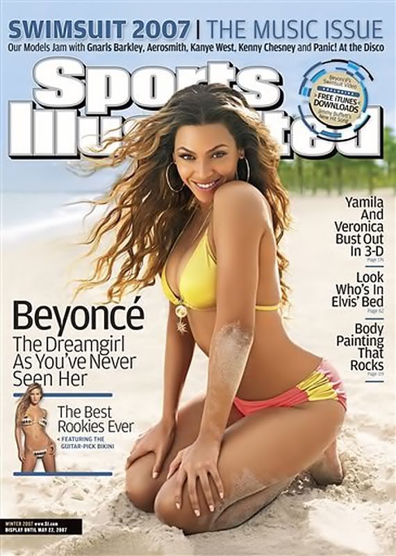
Sports?? Illustrated

More typical Sports Illustrated cover
          In "Framed and Mounted" by Rowe, "the most important object in sports photography is sport's prime instrument, the human body" (143). I think this is a little strange considering that many of the covers of magazines, especially ones with women, are photoshopped. Yes, the body is important and the prime topic in sports, but it is also altered. In the next section, Rowe even claims that "when the image is caught, it can be altered in many ways to improve its impact" (143). Even though the image is altered, it is acceptable because it makes a bigger impact? So would the impact be considered false or modified due to the change in the picture? What do you think? Should sports magazines be allowed to alter their pictures? Should they have a disclaimer saying that the photo has been altered? Why or why not?
          Later on, Rowe claims that how sports magazines show women versus men is radically different. Men are almost always shown in an action shot, while women are shown in "passive, non-athletic roles" (1
46). Is this supposed to make people relate to women more? Are they supposed to make the women seem more motherly, while men are made to seem more dominant in sports? Is this right? Should this be changed?
Sports Illustrated Cover:
 Kate Upton who is NOT an athlete
         The only time in which women are more dominant in sports magazines is in the yearly Sports Illustrated. Rowe mentions another magazine, Who Weekly, in which they had a front page story claiming to have top athletes pose nude. In fact, the magazine had four pictures. Two were of men and two were of women. One of the men was in an action shot, while the other three pictures were passive shots. The worst part of this spread, in my opinion, was the fact that the two men were only shown torso and up, while the women's whole body was shown.
Beyonce
African-American, but still fits ideal
          Skin color is also a controversial topic that sports magazines have tackled. Rowe states that "models with African ancestry...typically possessed very light-color skin and facial features that conform to the Anglo-American beauty ideal" (166). This poses that racism also occurs in sports magazines as well as sexism. The models that are selected to be shown have to conform to a certain ideal that the magazine wants to appeal to. Should these magazines be more realistic? Is it right to put an ideal out into the world that is realistically unattainable? Wouldn't this cause more problems than solutions?

Wednesday, September 18, 2013

The Wonderful World of Photoshop

          In "Images, Power, and Politics" by Sturken and Cartwright, it is discussed how images play a large role in our lives. Specifically, Sturken and Cartwright point out that  "a single image can serve a multitude of purposes, appear in a range of settings, and mean different things to different people" (9). They go on to give many examples and discuss a few in depth.
         In one of the first images that they share, they talk about how the photographer used the subjects' raw emotions to get the reaction that he wanted. This reminded me of several slaughterhouse videos and images that were shared with me over the summer while I was doing research into how animals were treated in their farms. I am not going to post images of these things here, but I do believe that they were posted initially to get reactions from the public. These images were used to spark action in people instead of being a pure entertainment image, like so many others. The authors state "the power of the photograph to provide evidence of violence and injustice is coupled with the photograph's power to shock and horrify" (11). Do you think that photos have this power? Should they be used primarily for this or entertainment? Why? Why not?

         Later on, Sturken and Cartwright point out that although we know that photos have the option to be altered, we usually have "the shared belief that photographs are objective or truthful records of events" (18). The most obvious example that came to my mind was that of models and fashion. Magazine covers and photo shoots of celebrities are always altered. America has especially looked to these images, which many people know are altered, to attain a standard for themselves. This ideal is highly unrealistic, and it causes many young girls to look to eating disorders to attain this extremely skinny appearance. This is another example of an action that is sparked by an image.

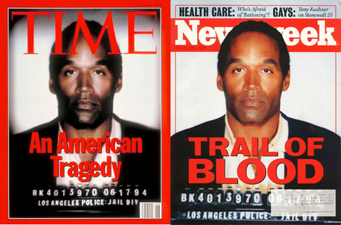
          It is also mentioned that during the OJ Simpson case, both Time magazine and Newsweek reproduced Simpson's mugshot as their cover. Newsweek placed an unedited mugshot on their cover while Time "heightened the contrast and darkened Simpson's skin tone" (25). I thought it was particularly interesting that Time would not allow the authors to reproduce the cover image in their book, while Newsweek did. To me, that seems like they are realizing that they should not have done that, but it has taken them a while to figure that out. What do you think? Should magazines be allowed to photoshop their covers? If so, should they have to declare it in their magazine? If not, why not? What benefits and costs would that have to the public?
          Towards the end, the authors discussed how a piece of art's value is "determined by economic and cultural factors" (34). They then go on to discuss Van Gogh's work as well as Pollock's. I thought it was incredibly interesting that they questioned why Van Gogh's paintings were in 1991, while when he was still alive, he never made any money off of them. The people during his time did not want to see his art because it was not the style back then. Today, however, it is a different story.

Saturday, September 14, 2013

One Post to a Better Blog

          In chapter 6 of Blogging, by Jill Walker Rettberg, she introduces the chapter by talking about how the internet is full of conversations and how "consumers communicate about products" (128). She discusses how customers "were getting accustomed to comparing other customers' reviews of products before making a purchase" (128). This really struck me because my family is dependent upon this. Even though we never comment or review an item, if my father finds one negative review about a product, he will discourage me from purchasing that product. I think that this has something to do with credibility and un-sponsored reviews. People are willing to listen to other people that have not been told by a certain company to talk about X product. If someone reviews an item and genuinely likes it and writes about it, it would give the product a bigger liklihood of being purchased. On the other hand, a product with many negative reviews, or in my family's case, just one, that item has a significantly lower chance of being purchased. Should products with negative reviews be able to hide the negative comments? Why or why not? Would this diminish their credibility?

         Later on, Rettberg discusses http://www.problogger.net/ and how the creator, Darren Rowse, used his tips to increase his own readership. Bloggers would read his blog and find some useful information. Rowse linked to participants of his "31 Days to A Better Blog" and they generally linked back to him. As they got more readers, so did Rowse due to his link on their pages.
          Another thing that Rettberg points out is that Rowse then had a "clear agenda for what he would blog about for a whole month" (149). This reminded me of another blog that I read: Undressed Skeleton. What she did that reminded me of Rowse's plan was that she planned to go vegan for a whole month. She then blogged her recipes and received feedback from her readers. She, like Rowse, had a structured plan for the month, but, unlike Rowse, she did not have her recipes set out exactly. She still had to create them, but maybe a day or two in advance, not as structured as Rowse. Is a structured blog a good thing? A bad thing? Why or why not? What are the benefits and cons?

Wednesday, September 11, 2013

Americas's Finest News Source

          In my last post, I talked about how I thought that radio was a two-way media. People could call in, get to ask their questions or request a song, and life would be good. Rettburg, however, has proved me wrong. In chapter four of her book Blogging, she starts off talking about how letters sent in and calls would be monitored and only select ones would be featured. This opened my eyes yet again on how media can control us. No matter what we say or send in, whoever is publishing that content can exclude our opinions. They pick the best of the best of who says good things about them. They are obviously not going to put in a negative review about themselves. Do you think that some media should find a way to publish all things sent in? Why or why not? What would come out of it?

          Later on, Rettburg explains a few ways in which blogs coincide with journalism. One point in particular really struck me. She explained that "blogs can give first-hand reports from ongoing events, whether wars, natural disasters, or crimes" (86). I watch a show called "The Newsroom" in which they recently reported on the Genoa case. They were struggling to find a reliable source, when a twitter feed came up. There were several tweets from one individual who was there, and he 'reported' what he saw. They used this information to justify their case against Genoa and to authenticate it. Later on in the chapter, it is mentioned how blogs are able to give immediate news. I compared this to the news site project we just completed in class. Those sites gave twitter feeds and showed their most recent articles that were posted. Blogs give a more immediate connection to those people who were directly involved. Instead of the information coming through a journalist, the eyewitness gives that information themselves. Rettberg finished the chapter with the very accurate statement that "blogs need mainstream media, and that today, the mainstream media also need blogs." (110)


          Kovach and Rosentiel talk about several things that journalists need to conform to. Those things are: "1. Never add anything that was not there. 2. Never deceive the audience. 3. Be transparent as possible about your methods and motives. 4. Rely on your own original reporting. 5. Exercise humility." (78). I think that although these point all should be a given, they need to be declared. Many journalists, I think, need to be reminded of these morals. They should not try to deceive their audience, because that would lose them credibility and with that, readers.


          Later on, Kovach and Rosentiel talk about fiction as nonfiction. This reminded me of mockumentaries and docudramas. For instance, when I first stumbled upon The Onion, I had no idea that it was all completely made up. I believed some information about it and proceeded to tell my friend about this awesome story that I read. Later, much to my humility, I found out that it was all fake. I believe that media that does this should have a highly visible disclaimer, either at the end or the front of the page. What do you think? Should mockumentaries and docudramas have a disclaimer? Why or why not? Benefits? Costs?

Monday, September 9, 2013

From Pigs to Posts

          After reading chapters 2 and 3 of Blogging by Jill Walker Rettberg, I definitely have A LOT to say. I thought it was particularly interesting that Rettberg started the second chapter with Plato sharing his opinions on writing: it would destroy peoples' ability to memorize something. His logic was why would someone remember something when they can just look it up? While this does make some sense, we know today that this is not the case. If anything, writing has shared with us more information on a huge variety of topics and thereby increased the level of education relative to if we did not have books. Plato also "complains that a written text is basically unresponsive" (33). Rettberg later explains that writing in blogs and online has actually created a more responsive audience. We can now comment, express our opinions, and question a certain article or post that someone has made.

          Rettberg mentions that the invention of the printing press did wonders for the spread of books and written work. She then mentions that, with the revolution of the printing press, came features that changed our culture. Those features are: dissemination, standardization, reorganization, data collection, preservation, and amplification and reinforcement. Once I read these and what they meant, it seemed very common sense. I looked back and wondered why I had not recognized all of this before.

          Another thing that came with the creating of the printing press was the spread of literacy. It was no longer upper class that had the luxury of reading. Literacy spread and continues today to do so. I do not think that someone in today's society, at least in the US, could get by without being able to read and write. She later goes on about how people reading silently was a new phenomenon. I used to get incredibly mad at my little brother when he would read out loud and would ask him to read silently. He would respond that he could not and I was terribly confused. I did not understand why he could not read to himself quietly. I guess this makes a little more sense now that I know that learning to read silently is actually a skill in among itself. How many people do you think are literate in the world today? In the US, the rates are 99%, while in Afghanistan, only 28.1% of people are literate.

          I do have an argument against a later statement by Rettburg. She claims that the radio was used as "one-to-many" type of media. My argument is that people call into radios all of the time. They get put on the radio commenting or asking for a particular song. While yes, this is still a one-to-many type of media, they listeners still get a chance to interact with the creators. It is not completely a one-way medium. What do you think? What are some other examples of a one-way media versus a two-way media? Are these the best that they can be? Should some forms of media switch?

          As for chapter three, Rettburg mentions the six degrees of separation, which I fully believe in. I recently found out that my cousin knows Maisie Williams - Arya Stark from Game of Thrones - and when I found out about this, besides being glared at by my family for freaking out, I thought about how I was only one person away from her, and by that, two people away from the whole cast of Game of Thrones. It was definitely an interesting and eye-opening experience. My cousin is also a weak tie for me, since she lives in England with my aunt, uncle, and other cousin. Since we grew up separately, she would not be the person that I would think to know anyone like Maisie. I actually found out through another aunt who told me when she visited last summer.

          Nearer the end of the chapter, Rettburg mentions danah boyd (who deliberately does not capitalize her name) and how "she identifies four characteristics of online social spaces that make them fundamentally different from offline social spaces" (76). She lists: persistence (information can be recorded and accessed later), searchability (people can find you), replicability (photos/conversations can be copied and modified so that someone cannot tell the difference from the original), and invisible audiences (not knowing who is viewing your blog). My biggest concern with these is the visibility to a professional when I leave school. My father recently warned me about another blog and how I should not advertise my habits and less than awesome things about myself. I took his advice to heart and changed some things about my other blog. I also never post anything on Facebook. It drives me absolutely nuts that people post things all the time. Anyways, boyd does have some good points about staying classy online and being aware of what you are getting yourself into. Do you think that there should be some sort of limitation or standard that some websites should put into place? Should Facebook monitor what people say and have a way to regulate it? Why or why not?

Thursday, September 5, 2013

Foxnews.com Review: On the Ball or Not?

Here is our groups' review of foxnews.com:

What is your first impression of the site? Think of the “3 second rule.” (pg 31)

  • Looks busy – text all over the place, maybe not enough visuals
  • When you scroll down, it encourages scanning because the font is small and makes you not want to look up close in detail
  • Most of the featured articles are of entertainment, not necessarily news events happening in the grand scheme of things

How does this site establish credibility? How does it establish trust? Or does it? (pg 28-29)
            Authentic voice?
            Genuine?
            Transparency?

  • Hard to decipher authenticity because it’s a very well-known news station source,
  • Certain articles does not feel genuine, doesn’t have reporters name
  • One or two sentences per paragraph which encourages reading
What is the general writing style?
            Biased?
            Objective?

  • Generally pretty objective
Does the writer IDENTIFY with his or her readers, or not? How (or why not)?

  • Author doesn’t really put their two cents into what they are writing, mostly just stating facts
Does the writing style get to the point?

  • Yes, short and concise
How is it arranged? Is it arranged in reverse pyramid style?

  • Not really, pyramid just goes from big headline to everything else in around the same
Is content shaped for scanning? How is the content layered? (p 32)

  • Yes because they’re all written in short concise paragraphs that make it easy to read, not overwhelming
  • First few sentences and headline pretty much already sums up the gist of the entire article
  • Starts with categories, which brings you to dozens of more articles within that category which you can then click on
Is the tone or rhythm of the site consistent throughout?

  • It stays pretty consistent in regards to tone because they are all spewing out facts and not really giving opinions, staying objective.
How does the site use headlines?

  • First article has a big headline that is in all capitalized font
  • Supported by a picture which gives us good information on what the article is about
  • First line is all capitalized and using very little words, with a supporting sentence underneath which I think attracts peoples attention to the article


How does it use links? Effectively or not?

  • When you click on a certain article, on the right hand side it’ll give you a list of more links to videos but they are not always relevant to the article which could be a drawback
  • It can be effective in the sense that, for example when we clicked on the pizza article link, on the right hand side it’ll give you a list of other articles within the Lifestyle category which makes it easier to navigate if you are only looking for articles in Lifestyle.
How is multimedia used? Is it distracting? How is it displayed on the site? Does the multimedia tell the same story as the text, or a different side of the story?

  • Not exactly distracting because it doesn’t pop up unless you actually intentionally click on it
  • It doesn’t always really give us a different side of the story, it seems like it follows the article, doesn’t really add anything different
How does the site “package” stories? (pg 36)

  • Doesn’t always show additional information relative to the article, only shows how many people shared it on Facebook or Twitter
  • However, certain articles will have additional links to other sources
How are graphics used?

            Too cluttered?
            Are the graphics consistent through out the site, and consistent to the brand?
            Do they encourage or discourage use, and how?

  • Each article has its own picture
  • Pretty effective in the way that they structured it on the page, having it right under each of the article’s headlines
  • Graphics are quite consistent
Can each page stand on it’s own?

  • Yes, every page is pretty much formatted the same way which is very helpful and makes it look and feel organized
How is the navigation? Do you get lost? Do you always know where you are? How (or why not)?

  • Navigation is good, links (Home, Lifestyle, Video, News) on every page that allows you to return or navigate to other sections on the website you want to go which is effective and useful

How does the site incorporate/interact with its audience? How does it embody the social aspect of the internet (or does it)?

  • Gives audience a wide range of news, including events and things happening in the entertainment industry, not just politics and science and things like that.
Here is a few screenshots of the whole foxnews.com website:


Do you think we are right? Anything else you can spot?