Here is our groups' review of foxnews.com:
What is your first
impression of the site? Think of the “3 second rule.” (pg 31)
- Looks busy – text all over
the place, maybe not enough visuals
- When you scroll down, it
encourages scanning because the font is small and makes you not want to
look up close in detail
- Most of the featured articles are of entertainment, not necessarily news events happening in the grand scheme of things
How does this site
establish credibility? How does it establish trust? Or does it? (pg 28-29)
Authentic
voice?
Genuine?
Transparency?
- Hard to decipher
authenticity because it’s a very well-known news station source,
- Certain articles does not
feel genuine, doesn’t have reporters name
- One or two sentences per paragraph which encourages reading
What is the general
writing style?
Biased?
Objective?
- Generally pretty objective
Does the writer
IDENTIFY with his or her readers, or not? How (or why not)?
- Author doesn’t really put their two cents into what they are writing, mostly just stating facts
Does the writing
style get to the point?
- Yes, short and concise
How is it arranged?
Is it arranged in reverse pyramid style?
- Not really, pyramid just goes from big headline to everything else in around the same
Is content shaped for
scanning? How is the content layered? (p 32)
- Yes because they’re all
written in short concise paragraphs that make it easy to read, not
overwhelming
- First few sentences and
headline pretty much already sums up the gist of the entire article
- Starts with categories, which brings you to dozens of more articles within that category which you can then click on
Is the tone or rhythm
of the site consistent throughout?
- It stays pretty consistent in regards to tone because they are all spewing out facts and not really giving opinions, staying objective.
How does the site use
headlines?
- First article has a big
headline that is in all capitalized font
- Supported by a picture
which gives us good information on what the article is about
- First line is all
capitalized and using very little words, with a supporting sentence
underneath which I think attracts peoples attention to the article

How does it use
links? Effectively or not?
- When you click on a
certain article, on the right hand side it’ll give you a list of more
links to videos but they are not always relevant to the article which
could be a drawback
- It can be effective in the sense that, for example when we clicked on the pizza article link, on the right hand side it’ll give you a list of other articles within the Lifestyle category which makes it easier to navigate if you are only looking for articles in Lifestyle.
How is multimedia
used? Is it distracting? How is it displayed on the site? Does the multimedia
tell the same story as the text, or a different side of the story?
- Not exactly distracting
because it doesn’t pop up unless you actually intentionally click on it
- It doesn’t always really give us a different side of the story, it seems like it follows the article, doesn’t really add anything different
How does the site
“package” stories? (pg 36)
- Doesn’t always show
additional information relative to the article, only shows how many people
shared it on Facebook or Twitter
- However, certain articles will have additional links to other sources

How are graphics
used?
Too cluttered?
Are the graphics consistent through
out the site, and consistent to the brand?
Do they encourage or discourage use,
and how?
- Each article has its own
picture
- Pretty effective in the
way that they structured it on the page, having it right under each of the
article’s headlines
- Graphics are quite
consistent
Can each page stand
on it’s own?
- Yes, every page is pretty much formatted the same way which is very helpful and makes it look and feel organized
How is the
navigation? Do you get lost? Do you always know where you are? How (or why
not)?
- Navigation is good, links
(Home, Lifestyle, Video, News) on every page that allows you to return or
navigate to other sections on the website you want to go which is
effective and useful

How does the site
incorporate/interact with its audience? How does it embody the social aspect of
the internet (or does it)?
- Gives audience a wide range of news, including events and things happening in the entertainment industry, not just politics and science and things like that.
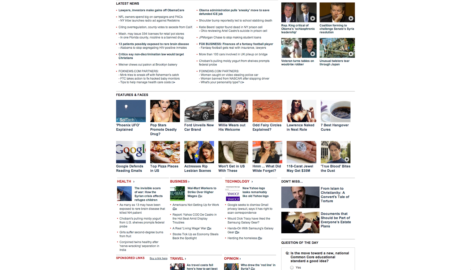
Here is a few screenshots of the whole foxnews.com website:


Do you think we are right? Anything else you can spot?
No comments:
Post a Comment